
【python绘图】matplotlib+seaborn+pyecharts学习过程中遇到的好看的绘图技巧(超实用!)(持续更新中!)
创始人
2025-05-28 07:06:23
0次
目录
- 一些必要的库
- 一些写的还不错的博客
- 按照图像类型
- 扇形图——可视化样本占比
- 散点图——绘制双/多变量分布
- 1. 二维散点图
- 2. seaborn的jointplot绘制
- 3. seaborn的jointplot绘制(等高线牛逼版)
- 组合点阵图
- sns.pairplot
- 叠加图Area Plot
- 按照功能
- 绘制混淆矩阵
- 绘制ROC&PR曲线(无敌)
一直以来对matplotlib以及seaborn的学习都停留在复制与粘贴与调参,因此下定决心整理一套适合自己的绘图模板以及匹配特定的应用场景,便于自己的查找与更新
目的:抛弃繁杂的参数设置学习,直接看齐优秀的模板
一些必要的库
import matplotlib.pyplot as plt
import seaborn as sns
一些写的还不错的博客
解释plt.plot(),plt.scatter(),plt.legend参数
seaborn.set()
按照图像类型
扇形图——可视化样本占比
散点图——绘制双/多变量分布
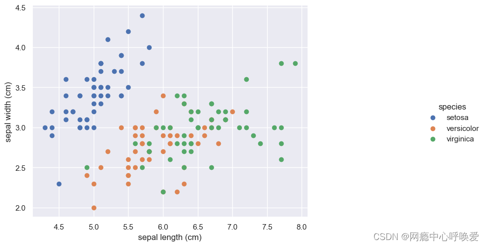
1. 二维散点图
#画散点图,第一维的数据作为x轴和第二维的数据作为y轴
# iris.target_names = array(['setosa', 'versicolor', 'virginica'], dtype='
数据集为鸢尾花,效果如下:
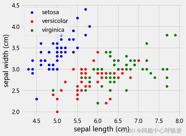
seaborn版本
sns.set(style="darkgrid")# 添加背景
chart = sns.FacetGrid(iris_df, hue="species") .map(plt.scatter, "sepal length (cm)", "sepal width (cm)") .add_legend()
chart.fig.set_size_inches(12,6)
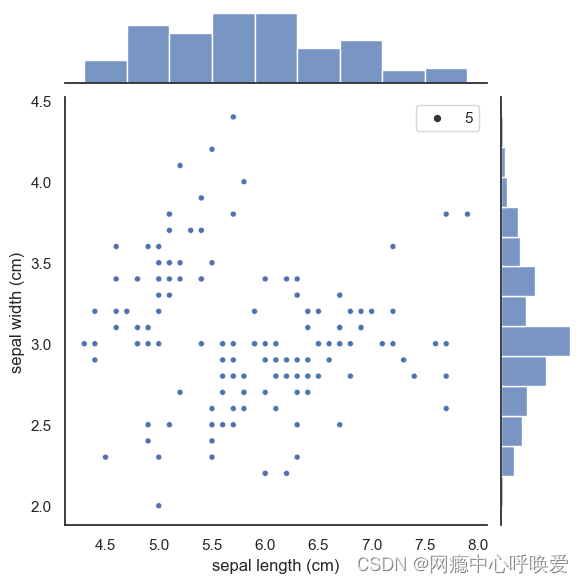
2. seaborn的jointplot绘制
sns.set(style="white", color_codes=True)
sns.jointplot(x="sepal length (cm)", y="sepal width (cm)", data=iris_df, size=5)
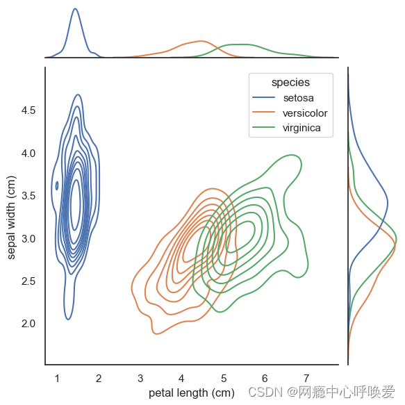
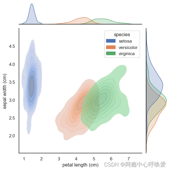
3. seaborn的jointplot绘制(等高线牛逼版)
# 没加阴影
sns.set(style="white", color_codes=True)
sns.jointplot(x='petal length (cm)', y='sepal width (cm)',data= iris_df, kind="kde", hue='species' # 按照鸢尾花的类别进行了颜色区分
)
plt.show()
sns.jointplot(x='petal length (cm)', y='sepal width (cm)',data= iris_df,              kind="kde",hue='species',joint_kws=dict(alpha =0.6,shade = True,),marginal_kws=dict(shade=True)
)
参考文章
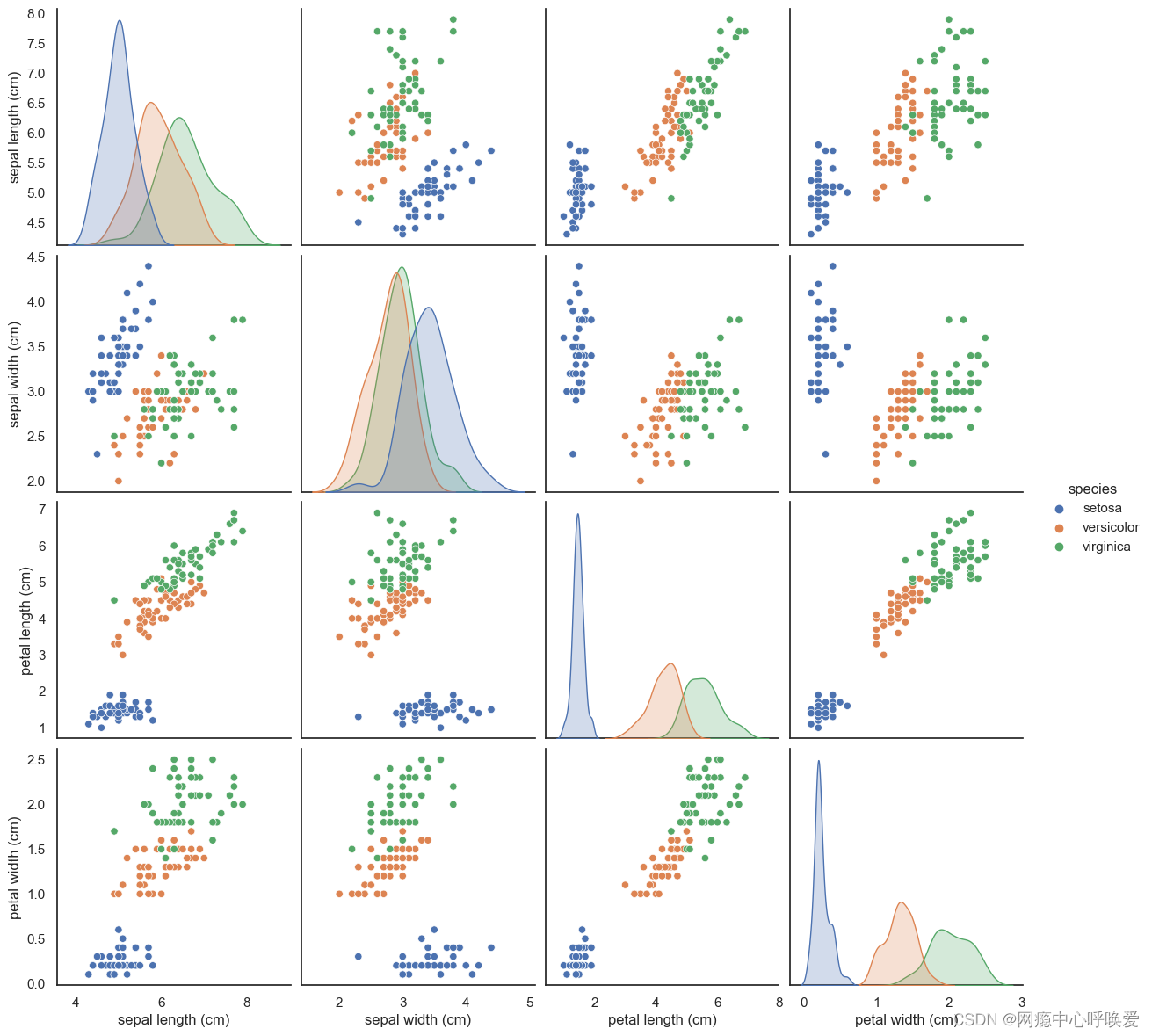
组合点阵图
sns.pairplot
sns.pairplot(iris_df, hue="species", size=3)
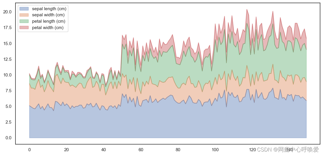
叠加图Area Plot
iris_df.plot.area(y=['sepal length (cm)', 'sepal width (cm)', 'petal length (cm)', 'petal width
(cm)'],alpha=0.4,figsize=(12, 6));
按照功能
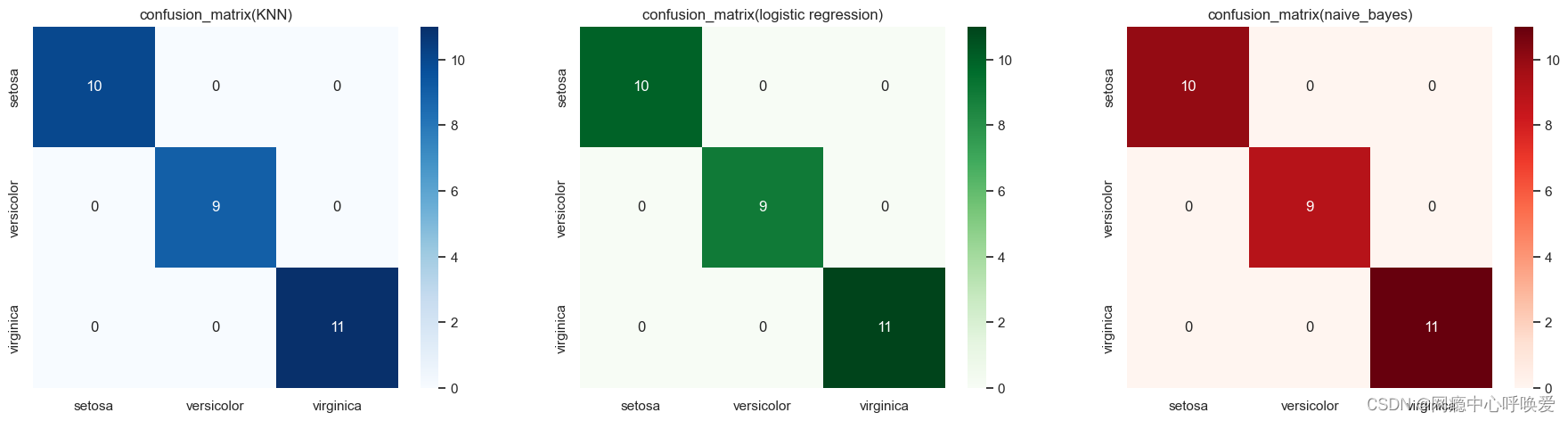
绘制混淆矩阵
其实就是热力图:
y_pred_grid_knn = knn_grid_search.predict(X_test)
y_pred_grid_logi = logistic_grid_search.predict(X_test)
y_pred_grid_nb = naive_bayes.predict(X_test)matrix_1 = confusion_matrix(y_test, y_pred_grid_knn)
matrix_2 = confusion_matrix(y_test, y_pred_grid_logi)
matrix_3 = confusion_matrix(y_test, y_pred_grid_nb) df_1 = pd.DataFrame(matrix_1,index = ['setosa','versicolor','virginica'], columns = ['setosa','versicolor','virginica'])df_2 = pd.DataFrame(matrix_2,index = ['setosa','versicolor','virginica'], columns = ['setosa','versicolor','virginica'])df_3 = pd.DataFrame(matrix_3,index = ['setosa','versicolor','virginica'], columns = ['setosa','versicolor','virginica'])
plt.figure(figsize=(20,5))
plt.subplots_adjust(hspace = .25)
plt.subplot(1,3,1)
plt.title('confusion_matrix(KNN)')
sns.heatmap(df_1, annot=True,cmap='Blues')
plt.subplot(1,3,2)
plt.title('confusion_matrix(logistic regression)')
sns.heatmap(df_2, annot=True,cmap='Greens')
plt.subplot(1,3,3)
plt.title('confusion_matrix(naive_bayes)')
sns.heatmap(df_3, annot=True,cmap='Reds')
plt.show()
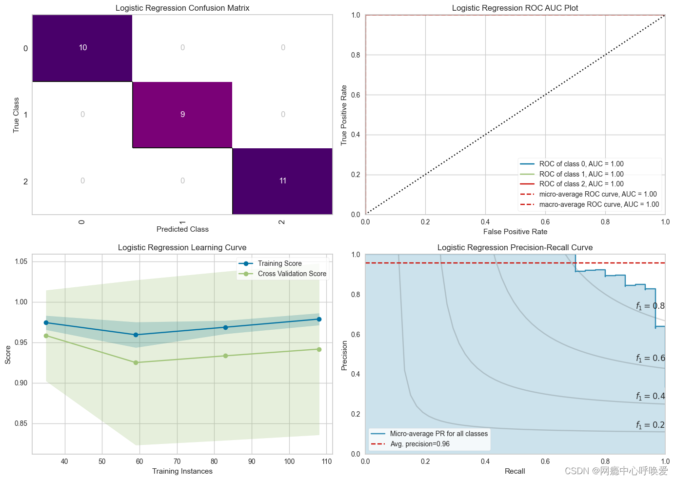
绘制ROC&PR曲线(无敌)
在kaggle 偶然看到的,这也太好看了,用到了yellowbrick这个库
from yellowbrick.classifier import PrecisionRecallCurve, ROCAUC, ConfusionMatrix
from yellowbrick.style import set_palette
from yellowbrick.cluster import KElbowVisualizer
from yellowbrick.model_selection import LearningCurve, FeatureImportances
from yellowbrick.contrib.wrapper import wrap# --- LR Accuracy ---
LRAcc = accuracy_score(y_pred_grid_logi, y_test)
print('.:. Logistic Regression Accuracy:'+'\033[35m\033[1m {:.2f}%'.format(LRAcc*100)+' \033[0m.:.')# --- LR Classification Report ---
print('\033[35m\033[1m\n.: Classification Report'+'\033[0m')
print('*' * 25)
print(classification_report(y_test, y_pred_grid_logi))# --- Performance Evaluation ---
print('\033[35m\n\033[1m'+'.: Performance Evaluation'+'\033[0m')
print('*' * 26)
fig, ((ax1, ax2), (ax3, ax4)) = plt.subplots(2, 2, figsize = (14, 12))#--- LR Confusion Matrix ---
logmatrix = ConfusionMatrix(logistic_grid_search, ax=ax1, cmap='RdPu', title='Logistic Regression Confusion Matrix')
logmatrix.fit(X_train, y_train)
logmatrix.score(X_test, y_test)
logmatrix.finalize()# --- LR ROC AUC ---
logrocauc = ROCAUC(logistic_grid_search, ax = ax2, title = 'Logistic Regression ROC AUC Plot')
logrocauc.fit(X_train, y_train)
logrocauc.score(X_test, y_test)
logrocauc.finalize()# --- LR Learning Curve ---
loglc = LearningCurve(logistic_grid_search, ax = ax3, title = 'Logistic Regression Learning Curve')
loglc.fit(X_train, y_train)
loglc.finalize()# --- LR Precision Recall Curve ---
logcurve = PrecisionRecallCurve(logistic_grid_search, ax = ax4, ap_score = True, iso_f1_curves = True, title = 'Logistic Regression Precision-Recall Curve')
logcurve.fit(X_train, y_train)
logcurve.score(X_test, y_test)
logcurve.finalize()plt.tight_layout();
相关内容
热门资讯
电视安卓系统哪个品牌好,哪家品...
你有没有想过,家里的电视是不是该升级换代了呢?现在市面上电视品牌琳琅满目,各种操作系统也是让人眼花缭...
安卓会员管理系统怎么用,提升服...
你有没有想过,手机里那些你爱不释手的APP,背后其实有个强大的会员管理系统在默默支持呢?没错,就是那...
安卓系统软件使用技巧,解锁软件...
你有没有发现,用安卓手机的时候,总有一些小技巧能让你玩得更溜?别小看了这些小细节,它们可是能让你的手...
安卓系统提示音替换
你知道吗?手机里那个时不时响起的提示音,有时候真的能让人心情大好,有时候又让人抓狂不已。今天,就让我...
安卓开机不了系统更新
手机突然开不了机,系统更新还卡在那里,这可真是让人头疼的问题啊!你是不是也遇到了这种情况?别急,今天...
安卓系统中微信视频,安卓系统下...
你有没有发现,现在用手机聊天,视频通话简直成了标配!尤其是咱们安卓系统的小伙伴们,微信视频功能更是用...
安卓系统是服务器,服务器端的智...
你知道吗?在科技的世界里,安卓系统可是个超级明星呢!它不仅仅是个手机操作系统,竟然还能成为服务器的得...
pc电脑安卓系统下载软件,轻松...
你有没有想过,你的PC电脑上安装了安卓系统,是不是瞬间觉得世界都大不一样了呢?没错,就是那种“一机在...
电影院购票系统安卓,便捷观影新...
你有没有想过,在繁忙的生活中,一部好电影就像是一剂强心针,能瞬间让你放松心情?而我今天要和你分享的,...
安卓系统可以写程序?
你有没有想过,安卓系统竟然也能写程序呢?没错,你没听错!这个我们日常使用的智能手机操作系统,竟然有着...
安卓系统架构书籍推荐,权威书籍...
你有没有想过,想要深入了解安卓系统架构,却不知道从何下手?别急,今天我就要给你推荐几本超级实用的书籍...
安卓系统看到的炸弹,技术解析与...
安卓系统看到的炸弹——揭秘手机中的隐形威胁在数字化时代,智能手机已经成为我们生活中不可或缺的一部分。...
鸿蒙系统有安卓文件,畅享多平台...
你知道吗?最近在科技圈里,有个大新闻可是闹得沸沸扬扬的,那就是鸿蒙系统竟然有了安卓文件!是不是觉得有...
宝马安卓车机系统切换,驾驭未来...
你有没有发现,现在的汽车越来越智能了?尤其是那些豪华品牌,比如宝马,它们的内饰里那个大屏幕,简直就像...
p30退回安卓系统
你有没有听说最近P30的用户们都在忙活一件大事?没错,就是他们的手机要退回安卓系统啦!这可不是一个简...
oppoa57安卓原生系统,原...
你有没有发现,最近OPPO A57这款手机在安卓原生系统上的表现真是让人眼前一亮呢?今天,就让我带你...
安卓系统输入法联想,安卓系统输...
你有没有发现,手机上的输入法真的是个神奇的小助手呢?尤其是安卓系统的输入法,简直就是智能生活的点睛之...
怎么进入安卓刷机系统,安卓刷机...
亲爱的手机控们,你是否曾对安卓手机的刷机系统充满好奇?想要解锁手机潜能,体验全新的系统魅力?别急,今...
安卓系统程序有病毒
你知道吗?在这个数字化时代,手机已经成了我们生活中不可或缺的好伙伴。但是,你知道吗?即使是安卓系统,...
奥迪中控安卓系统下载,畅享智能...
你有没有发现,现在汽车的中控系统越来越智能了?尤其是奥迪这种豪华品牌,他们的中控系统简直就是科技与艺...